React 심화
React 심화
styled Components
- className이 자동으로 부여된다.
- styled 뒤에는 유효한 html tag만 가능하다.
🔧 npm install styled-components
자동 완성 확장 프로그램
[VScode]
vscode-styled-components 설치
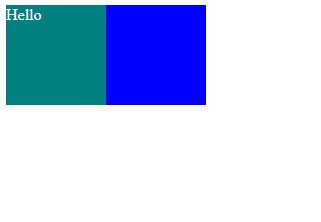
import styled from "styled-components";

const Father = styled.div`
  display: flex;
`;
const BoxOne = styled.div`
  background-color: teal;
  width: 100px;
  height: 100px;
`;
const BoxTwo = styled.div`
  background-color: blue;
  width: 100px;
  height: 100px;
`;
const Text = styled.span`
  color: white;
`;

function App() {
  return (
    <Father>
      <BoxOne>
        <Text>Hello</Text>
      </BoxOne>
      <BoxTwo />
    </Father>
  );
}

export default App;
결과
- props 사용하기
const Box = styled.div`
  background-color: ${(props) => props.bgColor};
  width: 100px;
  height: 100px;
`;
return (
  <Box bgColor="teal">
    <Text>Hello</Text>
  </Box>
  <Box bgColor="orange" />
);
as
as를 사용하여 속성을 바꿔줄 수 있다.
function App() {
  return (
    <Father>
      <Btn>Click me 1</Btn>
      <Btn as="a" href="http://naver.com">
        Click me 2
      </Btn>
    </Father>
  );
}
페이지 소스 결과

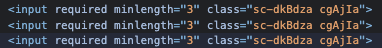
attrs
- 한번에 속성을 넣어 줄 수 있다.
const Input = styled.input.attrs({ required: true, minLength: "3" })`
  background-color: teal;
  color: white;
`;

function App() {
  return (
    <Father>
      <Input />
      <Input />
      <Input />
    </Father>
  );
}
페이지 소스 결과
animation
- 설명
import styled, { keyframes } from "styled-components";

const rotationAnimation = keyframes`
from {
transform:rotate(0deg);
}
to{
transform:rotate(360deg);
border-radius: 50%;
}
`;

const Box = styled.div`
  height: 200px;
  width: 200px;
  background-color: teal;
  display: flex;
  justify-content: center;
  align-items: center;
  border: 1px solid black;
  animation: ${rotationAnimation} 1s linear infinite;
  span {
    font-size: 30px;
    &:hover {
      font-size: 70px;
    }
    &:active {
      opacity: 0;
    }
  }
`;
💡span을 백틱안에 넣어 styled-components를 적용 받을 수 있다. 💡&는 span을 의미한다.
Theme
- 모든 색상을 가지고 있는 Object.
라이트모드 & 다크모드
index.js ```js import React from “react”; import ReactDOM from “react-dom/client”; import App from “./App”; import { ThemeProvider } from “styled-components”;
const darkTheme = { textColor: “whitesmoke”, backgroundColor: “#111”, }; const lightTheme = { textColor: “#111”, backgroundColor: “whitesmoke”, };
const root = ReactDOM.createRoot(document.getElementById(“root”)); root.render(
);
> App.js

```js
import styled from "styled-components";

function App() {
  const Wrapper = styled.div`
    display: flex;
    justify-content: center;
    align-items: center;
    height: 100vh;
    width: 100%;
    background-color: ${(props) => props.theme.backgroundColor};
  `;

  const Text = styled.h1`
    color: ${(props) => props.theme.textColor};
  `;

  return (
    <Wrapper>
      <Text>Hello World:)</Text>
    </Wrapper>
  );
}

export default App;
React Hook Form
- 복잡한 Form 코드를 단순하게 만들어 주는 라이브러리
- onChange 핸들러, prop, value, useState 등을 한번에 대체할 수 있다.
🛠️ npm install react-hook-form
register
- 유효성 검사(validation)를 React Hook Form에 적용할 수 있다.
watch
- form의 입력값을 추적할 수 있다.
handleSubmit
- form의 유효성 검사가 성공하면 from 데이터를 반환한다.
formState
- errors //에러를 보여준다.
<input
{...register("email", {
  required: `Write Your Email`,
  pattern: {
    value: /^[A-Za-z0-9._%+-]+@naver.com$/,
    message: `Please, Use "naver.com"`,
  },
})}
placeholder="Email"
/>
💡 value는 정규표현식 사용
setError
- form에 error가 있다면 알려준다.
localStorage
- 브라우저가 가지고 있는 임시 저장공간.
데이터 저장
localStorage.setItem(“key”,value)
데이터 읽기
localStorage.getItem(“key”)
데이터 삭제
localStorage.removeItem(“key”)
데이터 모두 삭제
localStorage.clear()
데이터 개수
localStorage.length
라이브러리
react-beautiful-dnd
- 드래그 앤 드롭
🛠️ npm i react-beautiful-dnd 🛠️ npm i --save-dev @types/react-beautiful-dnd 🛠️ npm i react-beautiful-dnd --legacy-peer-deps //버전 차이로 인한 에러 무시하기
DragDropContext
- 드래그 앤 드롭을 가능하게 하고 싶은 앱의 영역
Droppable
- 드롭 가능한 영역
💡 children은 함수여야 한다.
Draggable
- 드래그 가능한 영역
ref
- JS로부터 HTML 요소를 지정하고 가져오고 수정할 수 있는 방법.
React.memo
- prop이 변하지 않으면 컴포넌트를 다시 렌더링하지 않으며
변경된 prop이외에 나머지는 마지막 렌더링된 결과를 재사용한다.
useRef
const inputRef = useRef<HTMLInputElement>(null);
  const onClick = () => {
    inputRef.current?.focus();
    setTimeout(() => {
      inputRef.current?.blur();
    }, 5000);
  };